Bootstrap Grid Css
Grid system
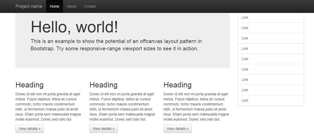
Bootstrap includes a responsive, mobile first fluid grid system that appropriately scales up to 12 columns as the device or viewport size increases. It includes predefined classes for easy layout options, as well as powerful mixins for generating more semantic layouts.
 Views: 1118
 2017
2017